It was ten years ago that we dreamed up Green and Gorgeous, after a long dog walk I finally found the name that had been just beyond my reach for months. A graphic designer and illustrator were employed and soon we had a logo and it was time to start growing some flowers!

I have always been very fond of our name and brand identity, it certainly has set us in good stead but as our business has grown and changed it is no longer the right fit.
A decade on and Green and Gorgeous has grown up and is a very different enterprise to when we started out so I wanted to create a new brand identity that would convey our matured business.
Our rebrand has been a year in the making, it has been a process which has been both fascinating and nerve wracking at times.
Initially I did what I always do when I want to get something done, I bought a book, Fiona Humberstone’s How to Style your Brand. The more I read the more I realised I needed help, I felt too in my business to have any clear perspective.
I approached branding consultants Opal and Co, as soon as I spoke to Clare I was reassured that I was in good hands she helped me with the brand blueprint which is really a branding strategy which gets to the heart of your company’s purpose and who it is for – your target customer. My discussions with Clare really helped to clarify the direction I wanted to take the business in over the next ten years and how I could stand out from my competitors.
Once I had my brand personality document it was time for the visuals and I already had Caz Harrison from Making Waves booked in. She had a waiting list and seems to be rather in demand. After seeing some of her recent commissions including Lucy the Flower Hunter I was pretty excited about what she would create for us.
Caz visited us here on the farm to get a sense of what we are about. We had a good look at my mood board on pinterest…finally it was my turn to get the pinterest out! Caz stated that G&G was definitely an Autumn personality with a touch of Winter. At this point I will direct to you Fiona’s book or website to explain the importance of knowing which season your business falls into if you are to use colour psychology to its full potential.
A few weeks later the Brand Snapshot file arrived in my inbox, it was a nerve wracking moment what if I hated it? Thankfully I didn’t in fact it felt very comfortable, almost familiar.
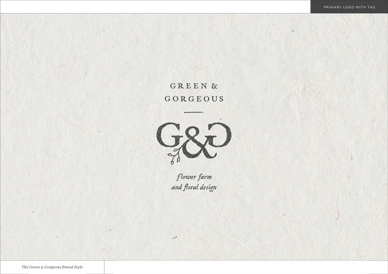
Caz started with an overview “The new Green and Gorgeous brand identity celebrates the gentle colours and textures of nature and honest British heritage”
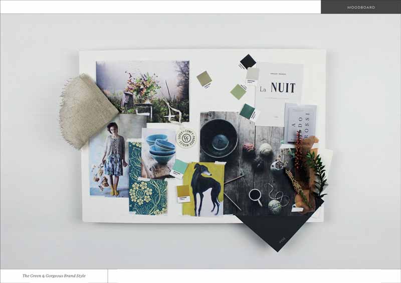
This is followed by a mood board which included some of my favourite brands, fonts, colours and artists. I think putting this together begins to set the tone and gets Caz in the right mind set to start sketching and pulling out pantone colours.
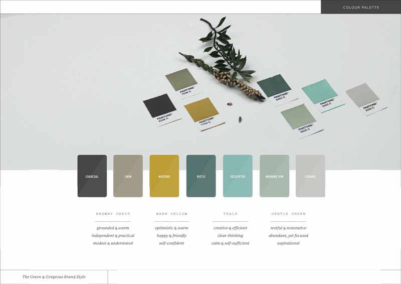
Next up our new colour palette, based on some of the keywords that came out of my brand blueprint. Caz has moved away from the obvious greens and seems to have miraculously chosen similar colours to the ones I am using to decorate our new home.
So it goes without saying that I really like them, particularly Beetle which is the colour she has taken through into our signage and printed material.
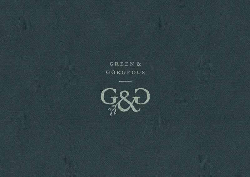
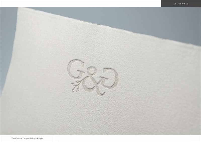
I wanted something timeless with the font, with a heritage feel. I like the fact it isn’t too defined and has a letterpress, handmade feel, I also thought it was high time we had an ampersand.
I was keen to have an abbreviated form as our name is a bit of mouth full and does not always fit on printed material. This is where Caz really worked her magic and came up with our mirror image icon.
She added in some mock ups so that I could visualise how the new brand would look on stationary, signage even on a tote bag, which would be great for course goodies.
So here it is just in time for Spring 2018 and hopefully it will stand us in good stead for the next ten years of ‘artfully cultivating flowers’.
Comments are closed.